When I first saw the 2015 Pantone Color of the Year, Marsala, I was not impressed. iStock showed it on its homepage as a kind of icky dark pink, and pink is my least favorite color, no matter the shade. After I visited Pantone to see what they were thinking, Marsala started to grow on me, and while I can see its merits, it still makes me a little queasy.
Pantone says Marsala is a “tasteful hue,” and, “Much like the fortified wine that gives Marsala its name, this tasteful hue embodies the satisfying richness of a fulfilling meal while its grounding red-brown roots emanate a sophisticated, natural earthiness.”
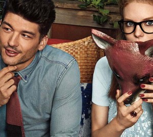
I would translate that to mean that it looks very much like a steak before you cook it. That image is not helped at all by this strange photo Pantone shows of a woman holding what appears to be a mask of a wolf’s face which is Marsala-colored. That, or it’s an actual wolf’s head from which she is about to drink. No, I’m pretty sure it’s a plastic mask. Either way, it’s creepy.
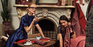
In fact, all the illustrations of Marsala are a bit off. We are told how versatile it is for decorating with pictures of a painfully thin model in blue satin hobbled by 6-inch heels with her friend in the leather dress as they drink wine, caress fabric, and address the torso of a man in a Marsala-coordinated vest.
Pantone almost dares you to like this color, which screams “SIN!” from the Marsala-shaded rooftops. But I confess they are probably right when they say it will go with almost anything. After all, sin is as versatile as it is appealing.


